Blog 12: Friday 21st May 2010

These two photographs are studies of the moving image. I have achieved this look by having a slow shutter speed and a low ISO. I used a bean bag to steady the camera so I didn’t get blurry images.


This photograph relays completely on lines of the moving cars for interest. I have saturated the colours to intensify the light’s colour to create richness to the composition. I like how the fire burns so brightly it glows in the night sky.


This is my most accomplished composition. Everybody says it’s their favourite. I do have to say it is a very busy composition but I think it works well. This photograph takes the concept of movement a step further with the powerful ghost-like movement of the train. The bubble car in the foreground is stylised and pop. I increased the saturation of colour which in turn increased the made the solar flares more prominent. As I have said before I like the look of solar flares because it makes my photographs look like magazine images. I would have appreciated the sky to me bluer on the day but I cannot change the weather. Overall I think the composition is balanced well and the parallel lines create a lot of interest.

Blog 11: Friday 14th May 2010

The largest and longest photographic study I conducted this semester was my study of the crossing. In total I have taken over 700 images of the crossing alone. I chose my composition carefully and then I spent three weeks trying to capture the perfect photograph. Each photograph has a strong emphasis on silhouette, line, and artificial light creating form. These photographs are my chosen pieces depicting the same scene but in very different ways.


This photograph was taken with a fast shutter speed to capture the boom gates rising. The busy crossing is frozen in time and there seems to be a heavy quality to the stillness. The photograph was taken at late sunset, just before dark. I like the atmospheric effect of the clouds and the highlight on the car’s boot.


This photograph was also taken with a fast shutter speed. Atmosphere plays a major role in this composition to give it a very masculine feel. The fog affects the colours creating a monochromatic composition. The ute is the focal point, in sharp focus and facing the scene. The image is quite stylised and looks like a car advertisement.


I think this cinematic image looks like a movie still. The original image was a little plain so I cross processed and it and increased the contrast. This composition does not focus on line like all of the other photos. The artificial lighting creates form and interest. I like how the green light of the sky is mimicked in the lights of the refinery and how the light from the car floods the scene.

Blog 10: Friday 7th May 2010


I thought I would take the car theme further and explore the aesthetic qualities of the freeway. On the way home from university I was inspired by the lines and forms created by the freeway’s bridges, white-lines and barriers. In this series I have taken photos from inside my car whilst driving. The extreme blues are from the blue of the car’s light filter at the top of the windscreen. I enjoy the strong colours, perspective and the forms created by the freeway.


This image is taken in a tunnel. The light seems to flood into the picture and set fire to the cars. This image reminds me of the movie The Terminator – because of the explosion of light and the ghastly power of the truck in the right of the composition. The truck is lit in such a way it seems menacing and indestructible. I had to Photoshop this image to get rid of the smudges caused by my windscreen.


This is my favourite freeway photograph. The composition is balanced perfectly into thirds of sky, freeway and car. The light that is reflected thought out the photo leads the eye and highlights points of interest. I like the pattern of the bridge railings leading into the distance and the perspective of the endless road ahead.

Blog 9: Friday 30th Apirl 2010

This next study is of a different part of the same power station focusing on the tower and the road. In these images I have concentrated on colour, line and movement. I really like the effect of the slow shutter speed and the moving car lights. Some of the images have solar flares, which I realise shows poor photography skills, but I think the flare makes the image look pop and stylised. . I have tried to create each of the compositions with a balance of foreground and background. I have increased the colours in Photoshop and cropped out things on the border which were distracting and disturbing the overall composition. The last image was taken on a clear day. I think the lack of clouds make the scene seem too still and fake.


Blog 8: Friday 23rd April 2010

I have decided to focus my attention on the refinery for the next couple of weeks. I plan to explore the different effects of light and atmosphere. I have all ready decided I prefer my photographs taken in the late light of dusk because of the long shadows and strong contrast it causes. The problem I need to overcome is the effect of low light on colour in my images.

These images have strong lines and contrast. I strengthened the colours in Photoshop to make them warmer. I like the oldness and liner pattern of the fence. I feel both these images rely greatly on the dramatic heavy sky. I have photographed this scene many times and I have come to realise the sky is a very important element.


These next two images are wide lens landscapes. both of these images were taken after the sun had set. The more purple image was taken one night when the sky was full of smoke from burning off. I couldn't resist going out and taking photographs that night because the sky was amazing. I have increased the contrast in both of these images to create a silhouette of the power station and to minimise the detail of the foreground.


Blog 7: Friday 16 April 2010


I wanted to find out how to make my images sharper and more vivid in colour. Some of my photos up till now have been a little dull. Stuart, my lecturer has told us that the smallest amount of photo shopping is best. So I looked into how to enhancing my images with my camera controls.
Maximum settings for sharpness, contrast and saturation


This is an example of high saturation in a photo. I also used the digital macro setting to get a very Sharp close-up photo. I liked the way it blurred the background.


Notes from class
When in Adobe Bridge open the selected images in camera raw.
When up loading images to the Internet the size of the photos should be:
Flickr: La Dolce Vita 2010
Flickr: p 1024 @75 p.p.i
Blog: 640 – 480 pixels
Save as a jpg for the internet.

Blog 6: Friday 2nd April 2010


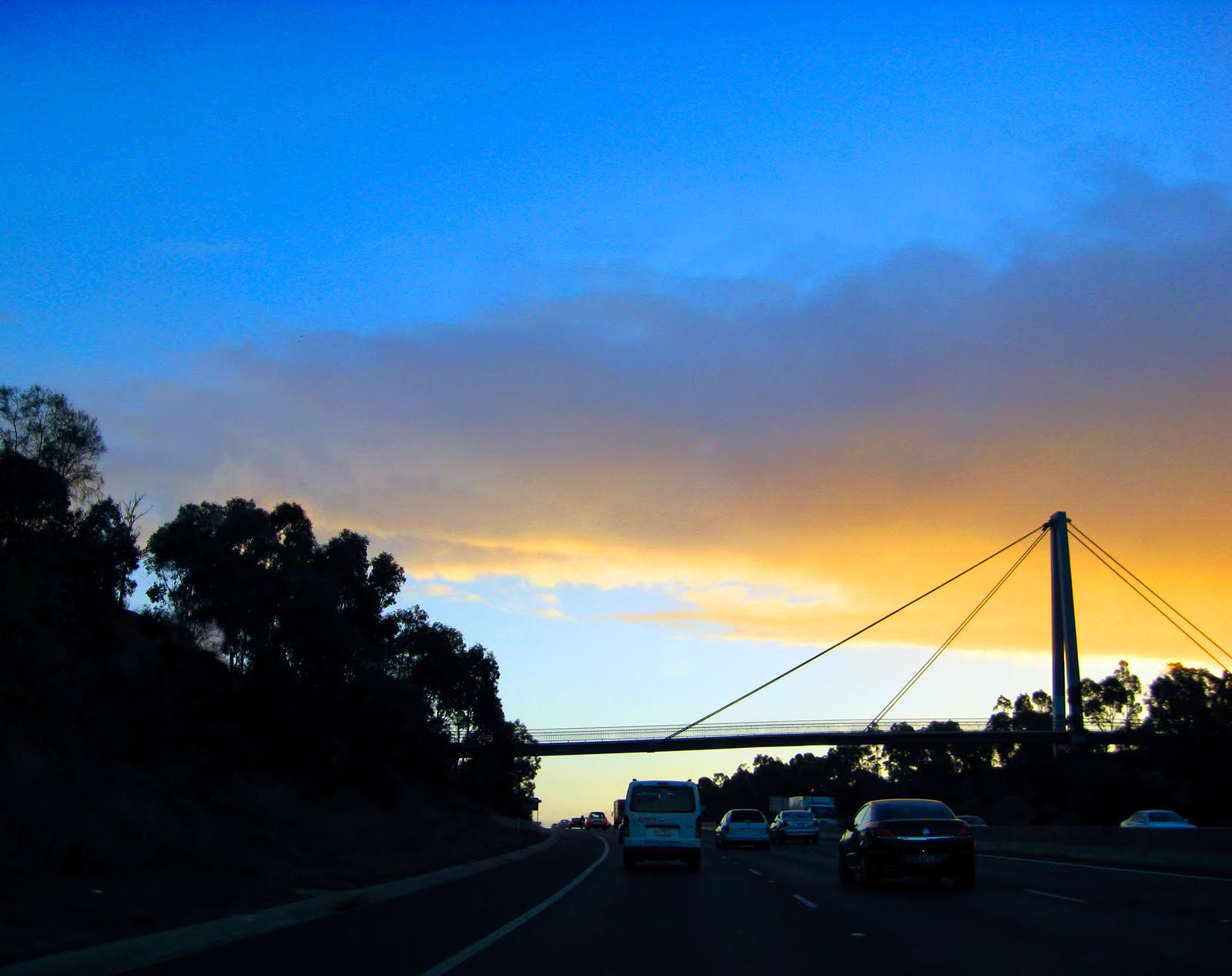
I have been taking photos of my local area, Williamstown. The image with the car was by far the most artistically satisfying. I really like the effect of the afternoon sun, it's like it has been artificially light to look like a poster image. In the second image I have increased the contrast and put a warm filter on the lighter colours. The effect is a tropical, oldfashioned, magizine like image.

I have been taking a lot of photos lately, but I really don’t know what my camera settings are about. I have been struggling with the light in my photos, so I have sourced some help. I have borrowed a book called Digital Photography Quick Steps by Doug Sahlin to help me with my camera. The following is what I have learnt so far.

My camera is a new Canon digital IXUS 80IS 8.0 mega pixels.
I have now set my camera’s image size a quality to super fine and a large 8m 3264x2448. This is so my images have a high-resolution and pick up on subtle colour variations.
Focusing for my camera is achieved by pressing the shutter button halfway.

I have also learnt about the mattering mode tool which determines the exposure of the scene.
• Evaluative: for even lighting. Scene metered from multiple metering zones – good for back lit subjects.
• Centre-weighted average: when the background in brighter than the subject, so the scene is metered from a small area in the middle.
• Spot: when the subject is in the centre of the scene where it is metered and then averaged for the entire scene.


Blog 5: Friday 26th March 2010

ISO is the film speed. If you use an ISO setting higher than 400 then the image may have digital noise in the form of coloured specks. You can use a noise filter to dampen the noise.
• Low-speed film is used in bright light
• High-speed film is used in dim light


The first photo shoot I did of the power station I was working with very low light so I had a high ISO about 8oo. But this caused the images to have digital noise and I wasn't happy with the result. I decided to return to the sceen with a bean-bag to stableise the camera whilst I worked in a lower ISO of 80 because I was having trouble with blurring. The result was much better.